KQED EDUCATION
Overview
As a Senior Designer at KQED I was tasked with managing the lifecycle of a rebrand for KQED Education. This was a complex task, as “KQED Education” was itself not a brand; rather, the project involved designing a system that would visually unify a handful of evolving programs and products that existed in a complex ecosystem of varying formats, audiences, use cases, and intent. The goal was to establish a cohesive look and feel that was unique, flexible, and leverage the equity of the KQED brand within the Bay Area education community.

Limitations and challenges
This project was constrained by a mess of tight timelines and evolving needs, as the entities that fell within this rebrand were in varying stages of development. The “what” of the rebrand was an incomplete picture, which left a lot of guesswork when it came to mapping out what the facets of the system would be. We also lacked resources for audience research and testing, so the design process was driven by a dismantling and reconfiguring of existing systems, as well as close collaboration with KQED Education partners, who had a deep investment in the members of the community that these programs reached, and were tapped into their general preferences and behaviors.
Another major limitation that drove the outcome was that we were not starting from scratch. A stand-alone website had just been developed for Youth Media Challenge (YMC) that was driven by a product-centered design system with a considered look and feel. The website was in the final stages of development, so the new Education brand system would need to strategically incorporate the recent branding work that the product team developed for the website. We also had to consider maintaining cohesion with the KQED brand.

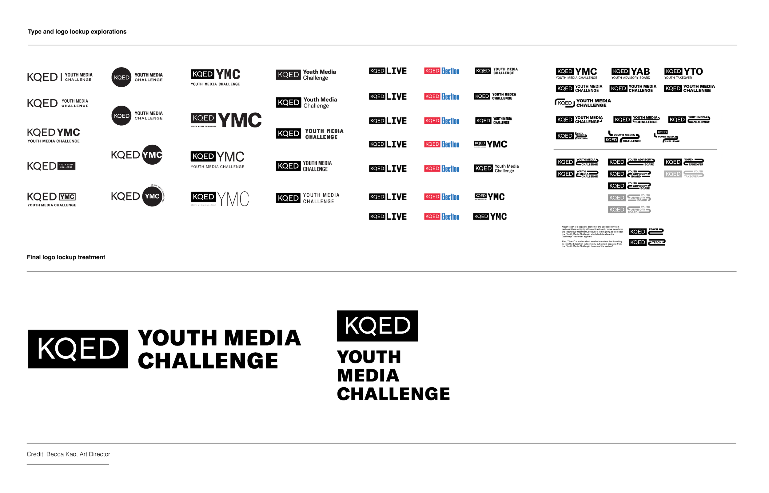
Logos
The first step in unifying the entities within the brand was to design a KQED branded lockup treatment which could be applied to all of the programs and products. After conducting an audit and study of the existing KQED sub brand ecosystem and expansive explorations of different expressions within the KQED brand fonts, we landed on a treatment that championed legibility and felt appropriate for both youth and adult audiences.
Colors, graphics, and imagery
Color strategy, graphic motifs, and image treatment systems were developed more or less in tandem with our deep dive into the architecture of the brand. Working closely with Education partners, we sought to understand what each entity was, how it sat in relation to other entities, and who the audience / participation group was. We needed to understand what united these disparate but overlapping programs and products, and identify key differentiators (i.e., Youth Media Challenge needed to have a certain cool factor to appeal to youth, while KQED Teach needed to be branded more closely to the general KQED brand to leverage the brand recognition among adults).
Color: We decided to assign color palettes for specific audience groups that would overlap across the entities, rather than developing five distinct palettes. Building off of the color palette newly designed for the Youth Media Challenge website and leveraging existing KQED colors, we were able to develop a palette that had continuity and flexibility. Because of the scrappy nature of the project, we did a fair amount of guesswork when it came to selecting new colors, and would tweak them throughout the first two years of implementation.
Graphic Motifs: For the Youth Media Challenge website, our product team had established an image treatment / graphic motif that visualized the idea that the program opened up professional and academic pathways for students. “Pathways” resonated well across internal teams, so we used as a starting point this from which to build a larger graphic system for the rebrand. Through close collaboration with key stakeholders from KQED Education, we were able to make sense of how to visualize each program using the same metaphor, and designed different variations of “pathways” for each entity (i.e. Youth Takeover graphic accents would be intersecting lines because the program involved a crossover between student work and professional practice).
Imagery: When this project kicked off, the existing brand assets across KQED Education used a mix of collage, illustration, treated photography, and full bleed /color photography. We needed to simplify and unify our image treatments across programs, and refine our point of view on illustrations / vs. photography based on our new understanding of the brand architecture. The final proposed system designated image treatments that heroed photography of real students with respective “pathway" iterations incorporated as accents; we also defined exceptional use cases for illustration and iconography, which were needed in some cases for practical purposes, as well as to help communicate the subject matter and nuances of each program.

Brand Guidelines
I incorporated the initial iteration of the brand guidelines into the larger KQED brand book, and followed them to develop the new brand for Youth Takeover, design an updated look and feel for KQED Teach, and to guide the look and feel of a handful of miscellaneous Education marketing needs. Much of what was proposed in the guidelines was hypothetical, as the scope of deliverables, use cases, and content was still being finalized on the same timeline as the brand book.
Sticking stringently to the V1 brand guidelines was challenging and yielded mixed results. Over the course of a year, the Directing of Education Marketing and I worked closely to update and audit the system as new assets were launched, and eventually revisited the brand guidelines. The final iteration of the brand guidelines included revisions that reflected what we had learned in practice, both in terms of what resonated with our audiences and stakeholders and simplification of the brand architecture and project needs.


Implementation: Youth Takeover
With color palette, logo, and “intersecting pathways” motif in place, we were set to start building marketing deliverables for Youth Takeover, an annual program where students’ work is broadcast on public KQED television and radio channels. A key challenge was integrating a narrative-driven illustration with student photography and the pathways graphic motif. While we were able to deliver a suite of presentation and social media templates that closely followed the brand system, in the second iteration we made adjustments based on what we thought worked and what our client liked, and let the system evolve and flex.
Scope of work: art direction, design, illustration, animation


Implementation: KQED Teach
The ask for updating the KQED Teach was to freshen the look and feel of the website, which was built through a template specific for educators. As we didn’t’ have flexibility in the design of the site itself, the challenge was to apply the designated KQED brand color palette to the existing site assets. After several iterations of recoloring the KQED Teach icon set and explorations of site banner treatments, we landed on a scheme that utilized tints and monochrome, for a friendly, softer visual outcome that felt distinctly KQED.


